Basic Color Theory
Color theory encompasses a multitude of definitions, concepts and design applications - enough to fill several encyclopedias. However, there are three basic categories of color theory that are logical and useful : The color wheel, color harmony, and the context of how colors are used.
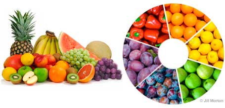
Color theories create a logical structure for color. For example, if we have an assortment of fruits and vegetables, we can organize them by color and place them on a circle that shows the colors in relation to each other.
The Color Wheel
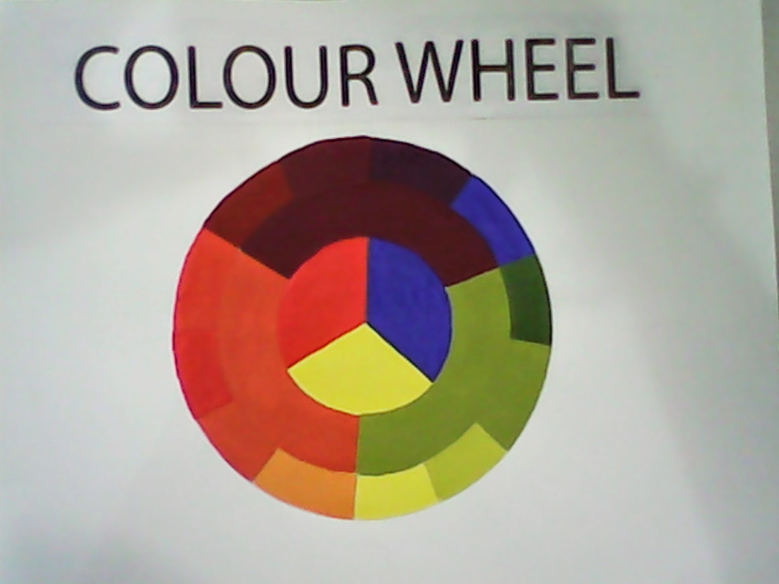
A color circle, based on red, yellow and blue, is traditional in the field of art. Sir Isaac Newton developed the first circular diagram of colors in 1666. Since then, scientists and artists have studied and designed numerous variations of this concept. Differences of opinion about the validity of one format over another continue to provoke debate. In reality, any color circle or color wheel which presents a logically arranged sequence of pure hues has merit
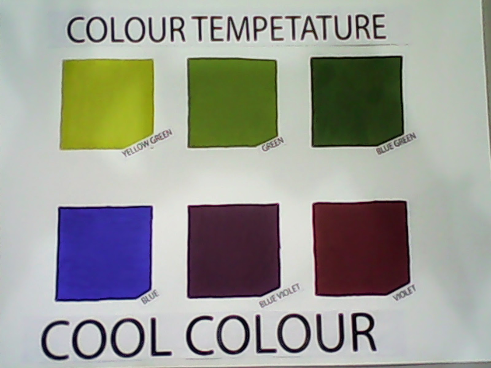
COLOUR TEMPERATURE
The color temperature of a light source is the temperature of an ideal black-body radiator that radiates light of comparable hue to that of the light source. Color temperature is a characteristic of visible light that has important applications in lighting, photography, videography, publishing, manufacturing, astrophysics,horticulture, and other fields. In practice, color temperature is only meaningful for light sources that do in fact correspond somewhat closely to the radiation of some black body, i.e., those on a line from reddish/orange via yellow and more or less white to blueish white; it does not make sense to speak of the color temperature of, e.g., a green or a purple light. Color temperature is conventionally stated in the unit of absolute temperature, the Kelvin, having the unit symbol K.
Color temperatures over 5,000K are called cool colors (bluish white), while lower color temperatures (2,700–3,000 K) are called warm colors (yellowish white through red).[1] This relation, however, is a psychological one in contrast to the physical relation implied by Wien's displacement law, according to which the spectral peak is shifted towards shorter wavelengths (resulting in a more blueish white) for higher temperatures.

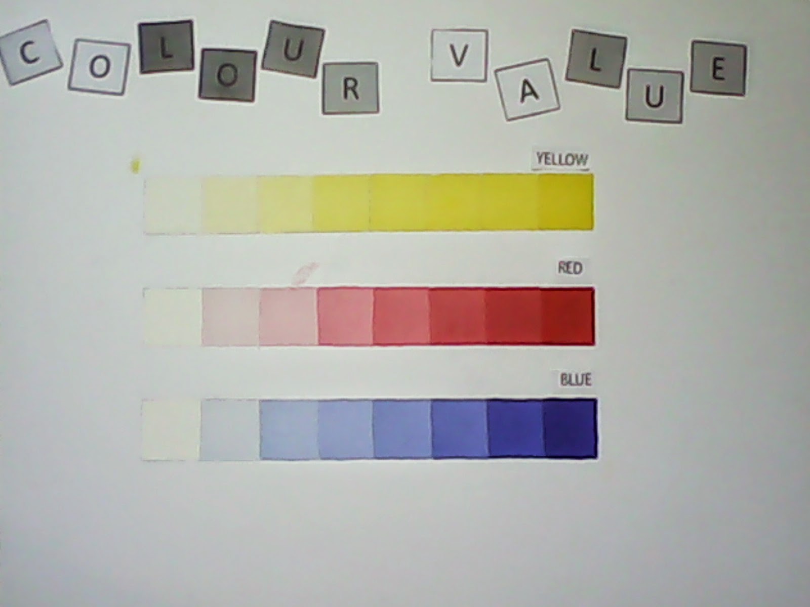
COLOUR VALUE
This is the second dimension of color and is possibly the simplest to understand. It is, according to Albert Munsell's definition, "The quality by which we distinguish a light color from a dark one." We noted that the first dimension did not tell us whether a color was light or dark. It told us that the color was green and not red, but we know that there may be light green and dark green. The function of Value is to tell us how light or how dark a given color is. For this purpose we shall need a scale of Value, which we may conceive as a vertical pole, or axis, to our circle of Hues. Black is at the lower end, representing total absence of light. White is at the top, representing pure light. Between these are a number of divisions of gray, regularly graded between black and white. This gradation could also be infinite. Since pure black is unattainable, we will call that 0 and begin our scale with the darkest gray as 1, numbering the steps up to 9, which is the lightest gray. Pure white, which is also unattainable, we will call 10. In the practical use of the scale of Value, therefore, we shall have but 9 steps and the middle one of these will be 5 - what is referred to as Middle Value. These steps of Value, have been scientifically measured and registered by means of an instrument called a Photometer.* In writing a color formula we express this dimension of Value by a numeral, which denotes at what step upon the scale of Value this color falls. This numeral is written above a line, as B 6/ for example, by which we mean that this particular blue, regardless of its other qualities, is as light or as dark as the 6th step upon the scale of Value. A color such as is commonly called "maroon" is an example of a red which is low in Value, because it is dark. What is called "pink" is a red which ishigh in Value because it is light. Now having familiarized ourselves with these two dimensions and understanding what qualities of a color they express, we may proceed to consider the third dimension. Without this third dimension our description of any given color is incomplete.


COLOUR HARMONY
 |
Complementary
Colors that are opposite each other on the color wheel are considered to be complementary colors (example: red and green).
The high contrast of complementary colors creates a vibrant look especially when used at full saturation. This color scheme must be managed well so it is not jarring.
Complementary colors are tricky to use in large doses, but work well when you want something to stand out.
Complementary colors are really bad for text.
 |
 |
Analogous
Analogous color schemes use colors that are next to each other on the color wheel. They usually match well and create serene and comfortable designs.
Analogous color schemes are often found in nature and are harmonious and pleasing to the eye.
Make sure you have enough contrast when choosing an analogous color scheme.
Choose one color to dominate, a second to support. The third color is used (along with black, white or gray) as an accent.
 |
 |
Triad
A triadic color scheme uses colors that are evenly spaced around the color wheel.
Triadic color harmonies tend to be quite vibrant, even if you use pale or unsaturated versions of your hues.
To use a triadic harmony successfully, the colors should be carefully balanced - let one color dominate and use the two others for accent.
 |
 |
Split-Complementary
The split-complementary color scheme is a variation of the complementary color scheme. In addition to the base color, it uses the two colors adjacent to its complement.
This color scheme has the same strong visual contrast as the complementary color scheme, but has less tension.
The split-complimentary color scheme is often a good choice for beginners, because it is difficult to mess up.
 |
FINAL
Retro style
From Wikipedia, the free encyclopedia
This article needs additional citations for verification. Please help improve this article by adding citations to reliable sources. Unsourced material may be challenged and removed. (July 2009)
|
Retro style is style that is consciously derivative or imitative of trends, modes, fashions, or attitudes of the recent past.
The term retro has been in use since the 1970s to describe[1] on the one hand new artefacts that self-consciously refer to particular modes, motifs, techniques, and materials of the past.[2] But on the other hand, some people (incorrectly) use the term to categorise styles that have been created in the past.[3] Retro style refers to new things that display characteristics of the past. It is mostly the recent past that retro seeks to recapitulate, focusing on the products, fashions and artistic styles produced since the Industrial Revolution, of Modernity.[4] The word "retro" derives from the Latin prefix retro, meaning "backwards, or in past times"
In France, the word rétro, an abbreviation for rétrospectif [5] gained cultural currency with reevaluations of Charles de Gaulle and France’s role in World War II. The French mode rétro of the 1970s reappraised in film and novels the conduct of French civilians during the Nazi occupation. The term rétro was soon applied to nostalgic French fashions that recalled the same period.[6] Shortly thereafter it was introduced into English by the fashion and culture press, where it suggests a rather cynical revival of older but relatively recent fashions.[7] In Simulacra and Simulation, French theorist Jean Baudrillard describes "retro" as a demythologization of the past, distancing the present from the big ideas that drove the “modern” age.[8]
The concept of nostalgia is linked to retro, but the bittersweet desire for things, persons and situations of the past has an ironic stance in retro style. Retro shows nostalgia with a dose of cynicism and detachment.[9] It is said that the desire to capture something from the past and evoke nostalgia is fuelled by dissatisfaction with the present.[10]
“Retro” can be applied to several things and artefacts, for example forms of technological obsolescence (including, for instance, manual typewriters, cash registers, bulky hand-held cellphones, etc.) and also the resurrection of old computer games and the equipment on which they are played. But most commonly “retro” is used to describe objects and attitudes from the recent past that no longer seem “modern.” It suggests a fundamental shift in the way we relate to the past. Different from more traditional forms of revivalism, “retro” suggests a half ironic, half longing consideration of the recent past.; it has been called an “unsentimental nostalgia,” [11] recalling “modern” forms that are no longer current.
Specific types of retro
This section may require cleanup to meet Wikipedia's quality standards. No cleanup reason has been specified. Please help improve this section if you can. (July 2009)
|
Fashion design
A 1940s retro-style dress with turban, designed in a modern electric blue, modeled by Karlie Kloss at a 2011 Anna Sui show.
Retro fashion refers to fashion from 1940-1990. Retro fashion is a clothing style which consists in wearing clothes commonly used in the past. This way of clothing often includes garments and accessories that are characteristic of such times, and many people use them in an exaggerated way and in combination with current clothing. Examples are leather handbags from the 1950s, "bell-bottom jeans", Poodle skirts, big sunglasses, fedoras, funky jackets (commonly Adidas Classics) and shoes, small neckties, chiffon
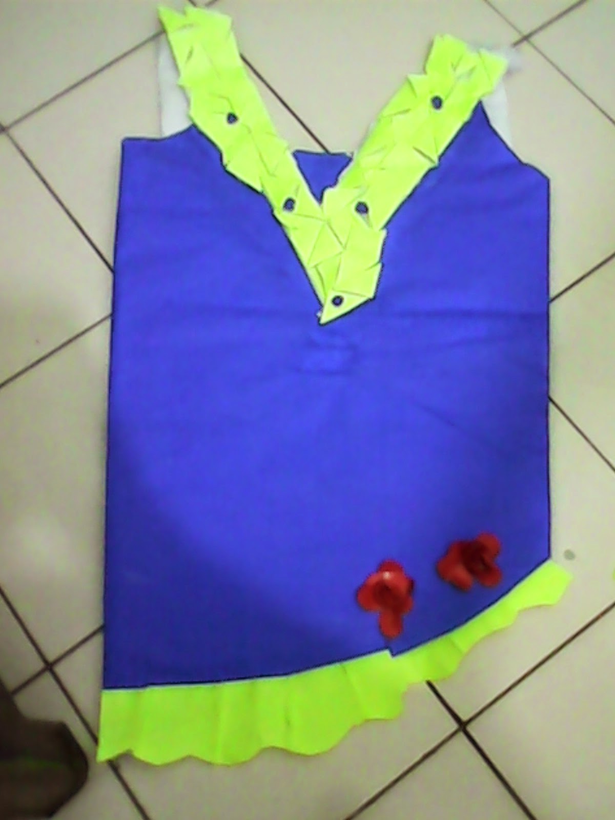
The colours that I have been used for my retro style dress is primary colour. Primary colours are red , blue and yellow . They are called primary colours because those colours are the main colour that can produce other colours in the colour wheel. For the theme of retro style , i have been through the research . In the conclussion of the research i get to know that the retro style has used most of bright colours at the early of 80s and 90s. Then slowly changed to the less bright colour to cool colour. The fashion changes to the change of years and trend. In theory, the Primary Colors are the root of every other hue imaginable. The primary pigments used in the manufacture of paint come from the pure source element of that Hue. There are no other pigments blended in to alter the formula.
In paint pigments, pure Yellow, pure Red, and pure Blue are the only hues that can't be created by mixing any other colors together. Printer inks and digital primaries are referred to as Yellow, Magenta and Cyan
Color Triads
By placing an equilateral triangle on the color wheel, you can create color schemes that have a lot of life to them. The most basic color triad is the three primary colors: red, yellow, and blue. But others are: green, purple and orange, or yellow-orange, blue-green, and red-purple scarves, sport equipment, skinny jeans[citation needed] etc. Makeup may also play a part in feminine retro fashions, with focal points being heavily-lined eyes and bright red lipstick; hairstyles such as pompadours, ponytails, and ducktails may be adopted, as well as styles that model film stars of the 1940s and 1950s.
A specific and clear example of this trend is the way in which the sport garments from the 1970s and 1980s are used nowadays. Soccer jackets, jerseys and t-shirts with former logos of the soccer associations are very popular; their designs commonly remember the old days by using lines in the sides and combinations of colors characteristic of those times. A specific case is the 1970 FIFA World Cup held in Mexico. Its logo and font type is used in a variety of retro sport garments. Brands such as Adidas, Puma and Nike have their own divisions specialized in retro products. Some soccer, baseball and basketball clubs also have re-edited their former garments to raise their sales.
Other examples are that the 1970s brought about a 1950s revival with American Graffiti, Grease, and Happy Days. This lasted into the 1980s with the rockabilly revival. The 1950s greaser look greatly influenced the punk subculture. In the late 2000s there a was a revival of neon and pastel colors, stereotypically associated with 1980s fashion. Nowadays, 1990s fashion has made a comeback, many of the fabrics and patterns ubiquitous to the decade (such as crushed velvet and floral) are popular now in the 2010s. Dr. Martens, a shoe brand popular in the 1990s, has also made a strong comeback in the early 2010s. 2011 - 2012 was the British company's best selling season of all time.[21]


.jpg)


